Transitional Design System

Transitional Design System

Unified design system built to support 150M+ users across devices for an OTT application. It streamlined workflows, strengthened designer–developer collaboration, brought consistency to fragmented UIs and enabled teams to scale with speed and clarity.

Unified design system built to support 150M+ users across devices for an OTT application. It streamlined workflows, strengthened designer–developer collaboration, brought consistency to fragmented UIs and enabled teams to scale with speed and clarity.

📱 Mobile

📱 Mobile

💊 Tablet

💊 Tablet

🖥 Desktop

🖥 Desktop

📺 TV

📺 TV

🧭  Project Overview

🧭  Project Overview

When two of the most-watched Indian streaming platforms Voot and JioCinema merged to form a single OTT ecosystem, it brought together 150M+ users, multiple content categories and a large, fast-moving product team spread across web, mobile, tablet and TV.

But with that scale came fragmentation. UI patterns were inconsistent. Designer workflows were redundant and the absence of a centralised design infrastructure was slowing down velocity, compromising consistency and burning out teams.

Timeline

2023 - 2024
7 months


6 Months

2023

User Base

150 Million+
Users

Domain

OTT, Entertainment


Company

Viacom 18 Digital

Media

Stakeholders

- Head of Design (1)

- Designers (4)

- UI Developers (3)

- Head of Design (1)

- Designers (4)

- UI Developers (3)

- Head of Design (1)

- Designers (4)

- UI Developers (3)

My Role

As a product Designer, I led research, strategy and UI design to create a scalable system that adapts to the product vision. We were designing for the evolving DNA of digital entertainment, not just UI consistency, but to enable designer velocity, developer alignment and a shared language across distributed teams.

Responsible for the end-to-end experience design. From user research to strategising solutions, crafting intuitive flows, wireframes and the final UI. I collaborated closely with cross functional stakeholders, ensuring the solution was scalable & accessible. Conducted internal testing to validate the experience and fine-tune interactions and aligned it with JioCinema’s vision.

🎭 A Day in the Life: When Systems Don’t Exist

🎭 A Day in the Life: When Systems Don’t Exist

Let me paint you a picture, one we knew all too well.

It’s a week before launch. A designer wraps up a feature after weeks of work. The PM greenlights it.

But the leadership review? Not so smooth. Suddenly, foundational changes are requested- colors, spacing, typography tweaks, all across 30+ screens.

The designer scrambles: hunting through files, manually editing, double-checking alignment, updating flows, fixing broken components... all while the dev team waits.

Responsible for the end-to-end experience design. From user research to strategising solutions, crafting intuitive flows, wireframes and the final UI. I collaborated closely with cross functional stakeholders, ensuring the solution was scalable & accessible. Conducted internal testing to validate the experience and fine-tune interactions and aligned it with JioCinema’s vision.

It’s a week before launch. A designer wraps up a feature after weeks of work. The PM greenlights it.

But the leadership review? Not so smooth. Suddenly, foundational changes are requested- colors, spacing, typography tweaks, all across 30+ screens.

The designer scrambles: hunting through files, manually editing, double-checking alignment, updating flows, fixing broken components... all while the dev team waits.

We saw this story repeat itself again and again.

⚠️ Key Challenges

  • Wasted Time: Designers spent hours identifying what needed to be changed on each screen.

  • Broken Flows: Minor changes to UI states disrupted entire journeys.

  • Redundant Work: The same edit had to be made across dozens of screens manually.

  • Visual Inconsistency: QA was rushed; UI drifted.

  • Burnout Risk: Without scalable resources, designers couldn’t focus on solving real user problems.

🧩 The Real Need

We didn’t need another component library. We needed a scalable design infrastructure. A system that could:

  • Offer replicable, modular design elements for both designers & developers.

  • Create visual consistency across all platforms

  • Act as a central source of truth for designers, developers, and PMs

  • Help cross-functional teams speak the same design language

  • Support brand-specific theming without duplicating effort

✅ Solution: A Transitional Design System

With no time to waste, we aligned on a single, strategic goal: Build a transitional design system that is flexible, scalable, and brand-aware.

This system needed to:

  • Support both Voot’s legacy UI and JioCinema’s evolving identity.

  • Be token-first with foundational design tokens for typography, spacing, radii, elevation and color.

  • Enable shared + brand-specific components for adaptability.

  • Allow designers to move faster, reduce errors and improve developer hand-offs.

🎯 Designing Across Devices

🎯 Designing Across Devices

🎯 Designing Across Devices

We aimed to design the system to adapt effortlessly across screen sizes from compact mobiles to large-screen TVs, ensuring consistency without compromise.

We aimed to design the system to adapt effortlessly across screen sizes from compact mobiles to large-screen TVs, ensuring consistency without compromise.

📁 File Architecture

📁 File Architecture

📁 File Architecture

Navigating files felt like a chaotic scavenger hunt, with a dozen versions of the same component and no clear source of truth. By building a modular file architecture, I created a single, organised system that streamlined the workflow, enabling faster collaboration and easier scalability.

Level 0 – Core Foundations

Core: The heart of the system. This file housed foundational tokens- colours, logos, icons and more, used across device libraries for consistency and scalability.

  • Images: With varied content needs, images were managed in a separate file- organized by ratios and categories tailored for OTT.

  • Docs: Detailed documentation guided usage, anatomy and states of components, enabling consistent implementation across teams.

Level 1 – Device Libraries

Level 1 – Device Libraries

Level 1 – Device Libraries

Device Files: We created three core libraries- Mobile, Web and TV. Each file was further split into pages of relevant components like buttons, toasts, and trays, tailored for specific platform behavior and UI patterns.

Device Files: We created three core libraries- Mobile, Web and TV. Each file was further split into pages of relevant components like buttons, toasts, and trays, tailored for specific platform behavior and UI patterns.

Device Files: We created three core libraries- Mobile, Web and TV. Each file was further split into pages of relevant components like buttons, toasts, and trays, tailored for specific platform behavior and UI patterns.

Level 2 – Working Files

Level 2 – Working Files

Level 2 – Working Files

Working Files: Managed by individual designers, these files pulled assets from the core and library files. They supported ongoing design sprints, ensuring alignment and efficiency across teams.

Working Files: Managed by individual designers, these files pulled assets from the core and library files. They supported ongoing design sprints, ensuring alignment and efficiency across teams.

Working Files: Managed by individual designers, these files pulled assets from the core and library files. They supported ongoing design sprints, ensuring alignment and efficiency across teams.

📐 Grids

📐 Grids

📐 Grids

A solid grid is the unsung hero of visual harmony, especially in an OTT platform packed with content.

Designing grids for JioCinema meant accommodating multiple screen sizes and breakpoints, all while ensuring that thousands of thumbnails and trays stayed visually aligned and scannable.

We wanted a system that can give us the flexibility to balance content density with design clarity, no matter the screen size. To solve this, we introduced a dual-grid system:

13 column grid:

13 column grid:

13 column grid:

Used for cards and trays. It supports left alignment and right scroll, allowing for partially visible cards that tease users into exploring more.

Used for cards and trays. It supports left alignment and right scroll, allowing for partially visible cards that tease users into exploring more.

Used for cards and trays. It supports left alignment and right scroll, allowing for partially visible cards that tease users into exploring more.

12 column grid:

12 column grid:

12 column grid:

Used across the rest of the app, enabling clean central alignment for content like navigation, filters or overlays.

Used across the rest of the app, enabling clean central alignment for content like navigation, filters or overlays.

Used across the rest of the app, enabling clean central alignment for content like navigation, filters or overlays.

Card arrangement on the grids

Card arrangement on the grids

Card arrangement on the grids

The other reason of having same number of column for all screen sizes is we could manage the card size based on the number of columns. The below tables showcases cards with included number of columns.

The other reason of having same number of column for all screen sizes is we could manage the card size based on the number of columns. The below tables showcases cards with included number of columns.

The other reason of having same number of column for all screen sizes is we could manage the card size based on the number of columns. The below tables showcases cards with included number of columns.

Cards with mobile grids

Cards with mobile grids

Cards with mobile grids

The other reason of having same number of column for all screen sizes is we could manage the card size based on the number of columns. The below tables showcases cards with included number of columns.

The other reason of having same number of column for all screen sizes is we could manage the card size based on the number of columns. The below tables showcases cards with included number of columns.

The other reason of having same number of column for all screen sizes is we could manage the card size based on the number of columns. The below tables showcases cards with included number of columns.

Cards with Web grids

Cards with Web grids

Cards with Web grids

The other reason of having same number of column for all screen sizes is we could manage the card size based on the number of columns. The below tables showcases cards with included number of columns.

The other reason of having same number of column for all screen sizes is we could manage the card size based on the number of columns. The below tables showcases cards with included number of columns.

The other reason of having same number of column for all screen sizes is we could manage the card size based on the number of columns. The below tables showcases cards with included number of columns.

The next step:

At this stage, we moved from foundational tokens to fully functional components.

This unit focuses on the Level-1 files- device specific libraries for mobile, web and TV, each organized into multiple pages containing components like buttons, chips, trays and toasts.

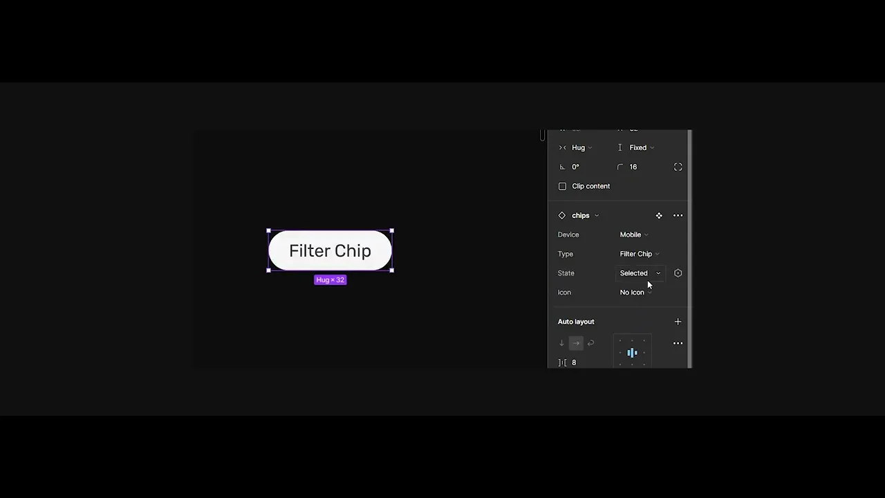
I personally contributed to building the Chip component, which later appeared across various touchpoints, from navigation to information collection.

To kick things off, here’s a diagram illustrating how different levels of the system come together on a single screen.

🔹 Chips

🔹 Chips

🔹 Chips

Chips are compact UI elements, similar to buttons that help label, filter and categorise content efficiently. On our platform, we use them in three key ways:

Chips are compact UI elements, similar to buttons that help label, filter and categorise content efficiently. On our platform, we use them in three key ways:

1. Assist Chips: Used to group or highlight content around a theme or category.

Example: Entertainment, Sports, Health in the top navigation bar.

1. Assist Chips: Used to group or highlight content around a theme or category.

Example: Entertainment, Sports, Health in the top navigation bar.

1. Assist Chips: Used to group or highlight content around a theme or category.

Example: Entertainment, Sports, Health in the top navigation bar.

2. Filter Chips: Act as toggles, enabling users to include or exclude content dynamically.

Example: Filters within the sub-navigation in settings.

2. Filter Chips: Act as toggles, enabling users to include or exclude content dynamically.

Example: Filters within the sub-navigation in settings.

2. Filter Chips: Act as toggles, enabling users to include or exclude content dynamically.

Example: Filters within the sub-navigation in settings.

3. Input Chips: Appear as selections made by users in input spaces such as bottom sheets or side sheets. Depending on their context, chips can be interactive or static, adapting to the user flow they support.

Example: Used for collecting information for progressive profile creation.


When used in either of these ways, chips can be either interactive or not depending on their context.

Specifications of chips

Specifications of chips

Specifications of chips

Each chip variant is defined by consistent padding, radius, typography, and spacing to ensure scalability across devices for seamless handoff and implementation.

Each chip variant is defined by consistent padding, radius, typography, and spacing to ensure scalability across devices for seamless handoff and implementation.

Each chip variant is defined by consistent padding, radius, typography, and spacing to ensure scalability across devices for seamless handoff and implementation.

Guidelines

1️⃣ Container

All chips are slightly rounded with a 16px corner.

All chips are slightly rounded with a 16px corner.

All chips are slightly rounded with a 16px corner.

Simpsons Homer
Simpsons Homer

2️⃣ Label text

Chip labels should be concise,
20 characters or fewer and follow the same typography style as buttons to maintain visual consistency across the interface.

Chip labels should be concise,
20 characters or fewer and follow the same typography style as buttons to maintain visual consistency across the interface.

Chip labels should be concise,
20 characters or fewer and follow the same typography style as buttons to maintain visual consistency across the interface.

Simpsons Homer
Simpsons Homer

3️⃣ Leading icon or image (optional)

Chip labels should be concise,
20 characters or fewer and follow the same typography style as buttons to maintain visual consistency across the interface.

Chip labels should be concise,
20 characters or fewer and follow the same typography style as buttons to maintain visual consistency across the interface.

Chip labels should be concise,
20 characters or fewer and follow the same typography style as buttons to maintain visual consistency across the interface.

Simpsons Homer
Simpsons Homer

4️⃣ Trailing remove icon
(optional, input & filter chips only)

Input and filter chips may feature a trailing "X" icon to allow users to quickly remove the chip, especially useful in search inputs or multi-select filters.

Input and filter chips may feature a trailing "X" icon to allow users to quickly remove the chip, especially useful in search inputs or multi-select filters.

Input and filter chips may feature a trailing "X" icon to allow users to quickly remove the chip, especially useful in search inputs or multi-select filters.

Simpsons Homer
Simpsons Homer

Chips aren’t buttons

  • Chips and buttons are similar in that they both provide visual cues to prompt users to take actions and make selections. However, there are important distinctions to be aware of.

  • Multiple chips should appear together in a group, whereas there should be no more than 3 buttons in a single arrangement.

Don’t use a chip in place of a button. Static actions that move the user forward or backward in the flow, like Save or Cancel should be displayed as buttons.

Don’t use a chip in place of a button. Static actions that move the user forward or backward in the flow, like Save or Cancel should be displayed as buttons.

Don’t use a chip in place of a button. Static actions that move the user forward or backward in the flow, like Save or Cancel should be displayed as buttons.

Do use chips to present contextual, supplemental options.

Do use chips to present contextual, supplemental options.

Do use chips to present contextual, supplemental options.

  • Chips are reactive and contextual, whereas buttons are static and predetermined.

  • A chip should offer a different action depending on the nature of the content it supports, whereas a button should be a persistent fixture of a layout.

  • Chips are reactive and contextual, whereas buttons are static and predetermined.

  • A chip should offer a different action depending on the nature of the content it supports, whereas a button should be a persistent fixture of a layout.

  • Chips are reactive and contextual, whereas buttons are static and predetermined.

  • A chip should offer a different action depending on the nature of the content it supports, whereas a button should be a persistent fixture of a layout.

Don't use chips for flow-ending actions.

Don't use chips for flow-ending actions.

Don't use chips for flow-ending actions.

Do use buttons for flow-ending actions.

Do use buttons for flow-ending actions.

Do use buttons for flow-ending actions.

  • From a user-flow perspective, chips represent forking paths in an experience while a button represents a linear step along a flow.

  • From a user-flow perspective, chips represent forking paths in an experience while a button represents a linear step along a flow.

  • From a user-flow perspective, chips represent forking paths in an experience while a button represents a linear step along a flow.

Don’t display a single chip by itself. Chips should appear in a set

Don’t display a single chip by itself. Chips should appear in a set

Don’t display a single chip by itself. Chips should appear in a set

Chips can be scrolled horizontally.

Chips can be scrolled horizontally.

Chips can be scrolled horizontally.

📚 Key Learnings

  • Small things have big impact. Naming conventions, labels, documentation - these seemingly tiny details made a massive difference in consistency and usability.

  • Organisation is a design skill. Creating well-structured systems and files helped smooth out communication, reviews and handoffs.

  • Design ≠ Just building; it's also understanding implementation.
    For example, we assumed mobile components would apply seamlessly to mobile web, but engineering limitations taught us otherwise.

  • Designing across devices means thinking across experiences. From hover states on web, tap feedback on mobile, to remote navigation on TVs, we had to ensure accessibility, responsiveness and familiarity for each context.

🎯 Reflections

Designing a Design System is much more than building screens, it's about crafting processes, alignment and discovery paths that bring coherence across an entire product ecosystem.

This project taught me how to design not just for users, but for those who design and build for users- our developers and design peers.

Some of my biggest takeaways:

  • Iterative and collaborative workflows lead to stronger outcomes.

  • You don’t always begin with clarity, sometimes chaos, clutter, and constructive criticism lead you to the clearest solutions.

  • Adapting to industry standards is a good start; refining them to suit your product needs is better. But co-building them with your team? That’s the best approach.

Design systems don’t end. They grow, shift and adapt.

This? Just the end of the beginning.

Responsible for the end-to-end experience design. From user research to strategising solutions, crafting intuitive flows, wireframes and the final UI. I collaborated closely with cross functional stakeholders, ensuring the solution was scalable & accessible. Conducted internal testing to validate the experience and fine-tune interactions and aligned it with JioCinema’s vision.